Multi-platform healthcare navigation experience
How it started
Designing a patient-facing healthcare navigation experience that meets patients where they are and builds trust to keep them in the continuum of care at a major Midwestern health system.
Patients were left to figure it out, alone
The Reality
Not all patients knew where even to get a mammogram close to them.
Then, if the screening results weren't clear, patients were often left without clear next steps, a single point of contact, or proactive outreach. The onus of follow-up fell entirely on them, often while navigating fear and uncertainty
The Consequence
Patients dropped out of the care continuum. Some went to competitors. Others disappeared entirely; their exodus wasn't even tracked. The health system was losing patients at every handoff.
Discovery & research
Before I fired up Figma, I spent weeks in the field.
Here's what I found, and how it shaped everything that followed.
27 Stakeholder Interviews
Nurse navigators, oncology staff, breast health coordinators, patients, and operations leadership across two clinical populations.
20 hours of direct shadowing
Shoulder-to-shoulder observation of nurse navigator workflows — seeing the tools, the workarounds, and the moments of friction in real time.
Synthesis & Mapping
3 Personas, a full-service blueprint, and a findings synthesis that became the shared language for every design decision and stakeholder review
Two patient personas, one product
Stacy
32–38, Greater St. Louis area. Two kids.. High tech comfort; uses sophisticated financial software, and secure platforms at work and home.
Traits
Organized, pragmatic. Values authenticity and autonomy. Empowered; doesn't need to be coddled, prefers to Get Stuff Done.
Behavior
Will make greatest use of technology on her own terms. Stacy appreciates that support is there if needed.
“I don't need someone to hold my hand. I need the right information at the right time."
Barbara
60+, rural SE Missouri — ~1 hour from Cape Girardeau. Sikeston is closer. Low tech comfort; may rely on landline over digital. Dislikes driving unfamiliar areas.
Traits
Strong sense of values. Wants local human support who "knows Cape." Values respectful tone, written confirmation, clear directions.
Behavior
Perceives St. Louis as distant and unfamiliar. Technology needs to meet her more than halfway. Barbara needs her healthcare to come to her — familiar locations, a real person on the phone.
“I just need someone who knows my area. Someone who knows Cape."
Five findings, one direction
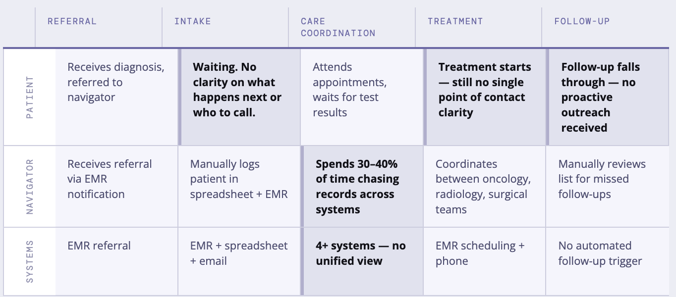
The patient carries the coordination burden
Navigators are managing follow-ups on sticky notes and calendar reminders. Patients are calling every day for openings. The system isn't reaching out — they are.
Care is fragmented from the patient's POV
"A broken breast health journey, overall." Imaging → diagnosis → aftercare → survivorship: no connective tissue. When diagnosed, patients panic and book four surgeons simultaneously.
Workforce shortages complicate every friction point
Radiologists, breast surgeons, mammo techs — shortages and burnout delay screening, extend wait times for diagnostics, and erode quality and timeliness of care across the board.
Patients are leaving and going untracked
A patient goes across the street for a mammogram, gets a cancer diagnosis, and disappears.
"We don't even track that as someone leaving the system. We track out-migration from biopsies done here."
Wait times and impersonal interactions are driving patients to competitors
"I waited 15 days for my MRI result. I'm not going there for treatment." Speed and personalization, not clinical quality, are why patients leave.
The problems live in the handoffs
Four principles for All decisions
Reach out first
The system contacts the patient, not the other way around. Proactive outreach closes the gap before the patient falls through it or calls a competitor.
Get there before Google
When patients get a scary result, they search the internet and panic. Deliver clear, calm, authoritative information before anxiety drives the next decision.
A person, not a portal
The confirmation screen shows a named navigator with her email. Not a ticket number. Not a system message. A person who will walk them through this.
Meet them where they are
Screenings at Walmart, Hy-Vee, CVS. SMS for Stacy. Phone callbacks for Barbara.
Location and channel match the patient, not the system's convenience.
Challenging assumptions
SMS-First outreach
Early thinking assumed patients would log into a portal. I pushed for SMS as the primary channel — it meets patients where they already are, requires no app, and works for both Stacy and Barbara.
Community locations, not clinical addresses
The scheduling UI initially only listed clinical facility addresses. I pushed to include existing mobile mammography events at familiar retail anchors — Walmart, Hy-Vee, CVS — because that's often how patients in this geography orient themselves.
No app download required
There was a push to build a native app. I argued against it — app installs are friction, and Barbara won't download an app. Mobile web with SMS links removes the barrier entirely.
Getting the patient to the mammogram
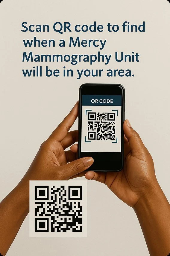
Patient scans a QR code at a pharmacy, clinic, or a community site, to find nearby mammography events
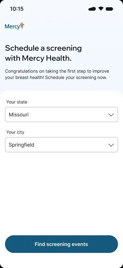
State and City selection to find nearby events, if we cannot determine where they are by location data.
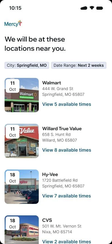
Familiar locations. Walmart, Hy-Vee, CVS, not clinical addresses
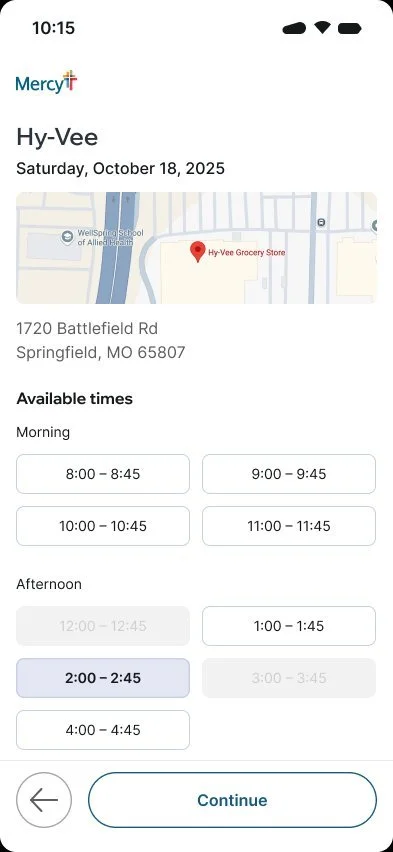
Visual time slot picker with location map.
No drop-downs, less friction.
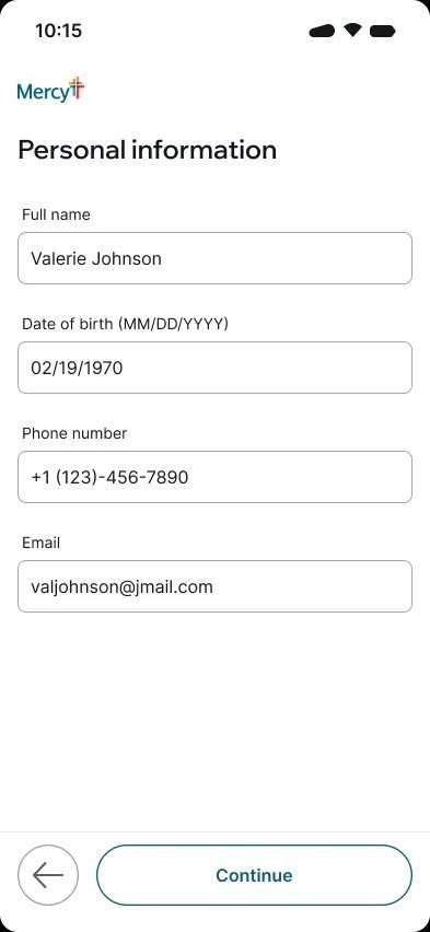
Minimal required fields, just what is needed to confirm the appointment.
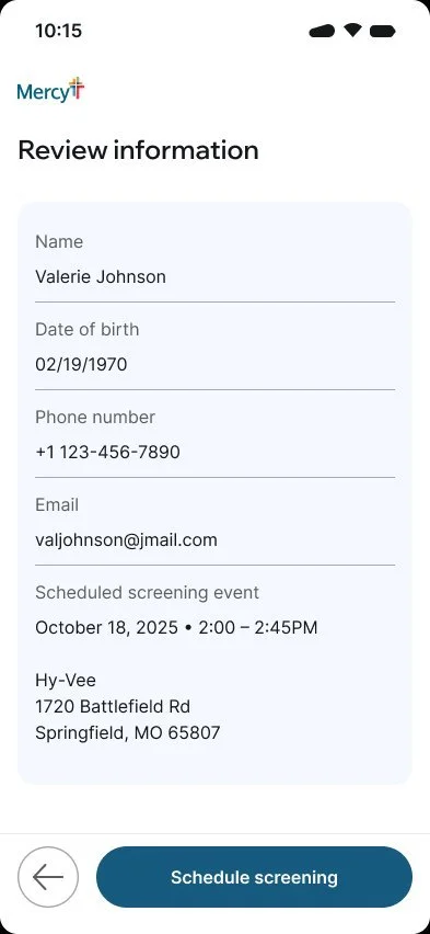
Clear summary before committing to build trust at the final step.
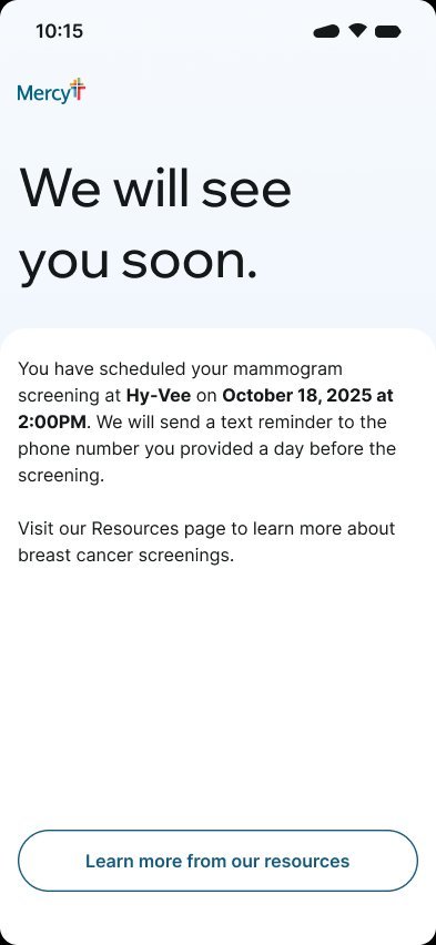
“We will see you soon” is a human promise, with an inclusion of an incoming text reminder.
After the screening,
the system reaches out first
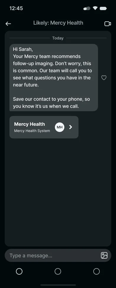
“Don’t worry, this is common.”
Build trust before anxiety sets in. Save the contact information so they can trust communication from Mercy moving forward.
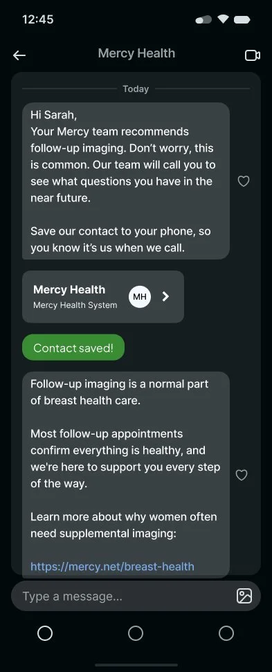
“Likely: Mercy Health” becomes Mercy Health. A small moment that makes the next call feel expected, not suspicious.
"Most follow-up appointments confirm everything is healthy."
Normalizing before the patient opens a search tab.
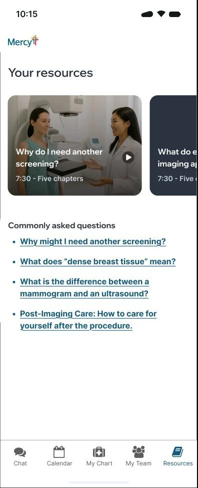
We answer "why do I need another screening?" before she googles it.
Content designed to inform, not alarm.
A person, a plan, a date on the calendar
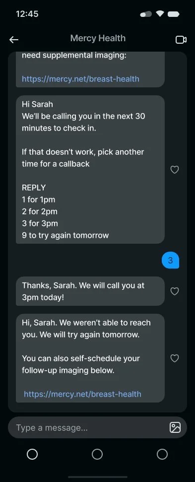
Reply 1/2/3 to pick a callback time.
Self-schedule link sent automatically so no one falls through.
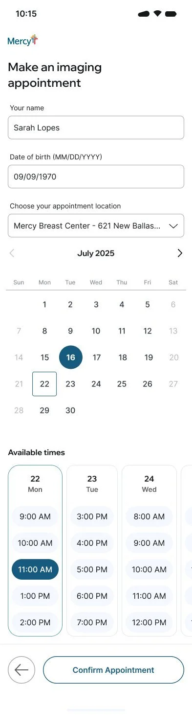
Calendar + time slots at the actual Mercy Breast Center. Same low-friction pattern as the screening flow.
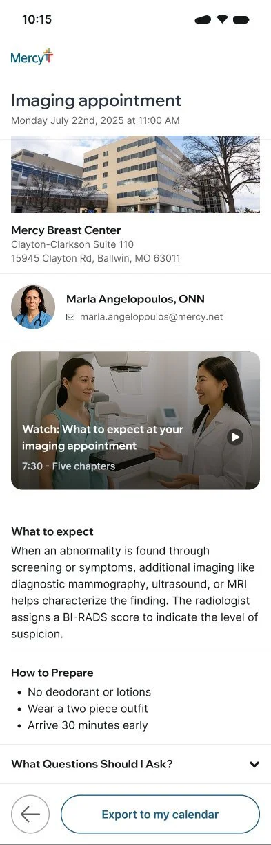
Patient sees who they will be meeting with, by name, with their email. Someone, not a web search. What to expect, how to prepare, and an export to the calendar.
Results
“It was the first time I’d seen a product proposal that focused on the patient’s trust in what we offer, not selling us a technology.”
- Clinical Director, post demo debrief
Research drives the design.
I’m a designer first, and understanding the problems and needs of the real users of the product and the context they live in is the start. The decisions that held up through every review came directly from the field, not assumptions.
In high-stakes domains, trust precedes creative latitude.
I had to demonstrate that I understood the complex relationships between the patients, healthcare navigation, and the nurse navigator's worlds before they'd engage with my proposals. Empathy isn't only a soft skill; it's access.
End-to-end ownership sharpens every decision.
When you hold the full thread, from interview to prototype to exec demo, you make better tradeoffs at every step.
That's how I fight for the users.